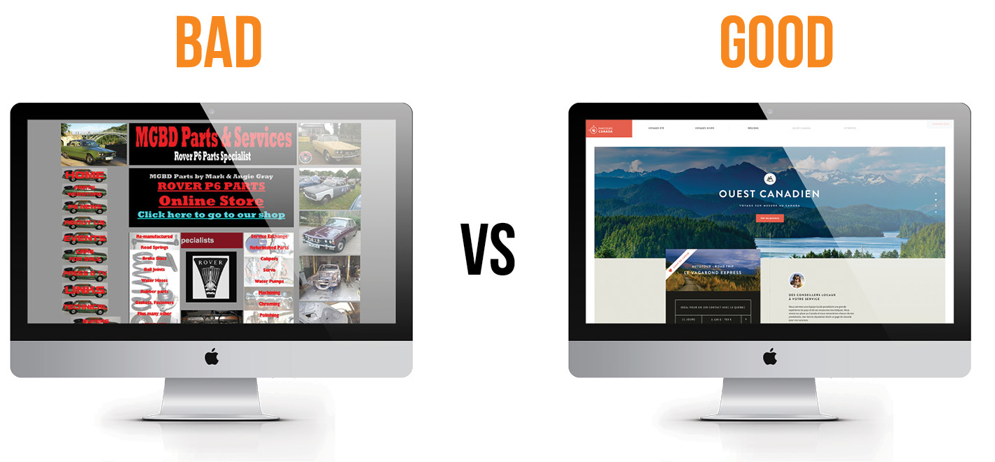
Factors that Separate Good Website from Bad Website
Website performance depends on a number of factors. It is essential to have a website that is well made. That may include proper optimization, good design, fast loading times and so on. This is essential as a good website performs well on SERPs(Search Engine Result Pages). The better the website, the higher the ranking on search results. This means higher visibility and chances to attract a greater amount of traffic to your web pages. Now to get started with building your website, you should understand a certain factors that might help you create a good website.
- User-friendliness
Nothing will annoy your users more than not being able to navigate through your website to get to the desired pages. A good design is necessary but overdoing it to compromise o function is something that will get you in trouble. The usability factor of a website would depend on the type of website you are building. For instance, an e-commerce shopping website should have effective search option, properly categorized etc. Websites that lack this will experience users leaving your website for other rival websites. Traffic will eventually be reduced and repeat visits would become impossible.
- Navigation
Facilitating user access to get to their desired portions of your website is a major concern. Navigation issues, if not addressed, can cause users to jump from your website by having a look on just one page and leaving. It becomes essential in this case to help them find what they are looking for with ease. The solution to this is having a proper navigation menu that would have links to other important pages on the site. Mega menus, as they are popularly known today, are a good choice for better navigation. This is one of the major factors that separates a bad website from a good website.
- Aesthetics
Another one of the determining factors of a good website is the overall aesthetic, the look of the website. It is crucial to have a design that at the very least rivals that of your competitors. Old design is very easily recognizable by users and can immediately cause users to leave your pages. A fresh design that perfectly captures the purpose of your website and complements all other content is what you should aim for. A professional image is what your website should portray for users to take you seriously and send time in your web pages.
- Clear Vision
Many a times, in the pursuit of making your website better by adding and adding new features and elements, often the main purpose of your website is left behind. People should have a clear idea about what kind of website they are browsing through. For instance, a blog website should be able to tell users what kind of content they can expect to find. A product based website should able to communicate all that is necessary about the product to the end user. The key here is to keep it simple, to create a space free of clutter and one that doesn’t have to shout for attention


